 Page top
 Previous
 Homepage
 Next
Next
Box and Whisker Plot
Description
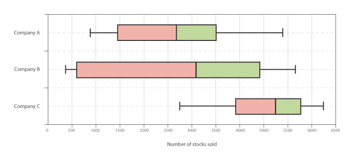
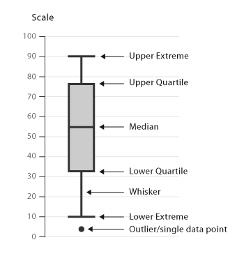
A Box and Whisker Plot (or Box Plot) is a convenient way of visually displaying the data distribution through their quartiles.
The lines extending parallel from the boxes are known as the “whiskers”, which are used to indicate variability outside the upper and lower quartiles. Outliers are sometimes plotted as individual dots that are in-line with whiskers. Box Plots can be drawn either vertically or horizontally.
Although Box Plots may seem primitive in comparison to a Histogram or Density Plot, they have the advantage of taking up less space, which is useful when comparing distributions between many groups or datasets.
Here are the types of observations one can make from viewing a Box Plot:
What the key values are, such as: the average, median, 25th percentile, etc.
If there are any outliers and what their values are.
If the data is symmetrical or not.
How tightly is the data grouped.
If the data is skewed and if so, in what direction.
Two of the most commonly used variation of Box Plot are: variable-width Box Plots and notched Box Plots.
Functions
When grouped:
Anatomy

Tools to Generate Visualisation
Code-based:
AnyChart (JS)
CanvasJS (JS)
FusionCharts
Google Charts (HTML5)
JSCharting (JS)
Mike Bostock’s Block (D3)
Plotly (Python)
Python Graph Gallery (Python: Seaborn)
React Graph Gallery (React/JS)
R Graph Gallery (R)
Vega
Vega-Lite
ZingChart (JS)
Webapp:
AnswerMiner
Flourish
PlotDB
RAWGraphs
Desktop App:
Microsoft Excel
Stata
Tableau
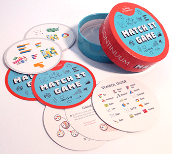
Check out our fast-paced, data visualisation-themed card game:
Merchandise & other related dataviz products can be found at the store.

